Patricia Green

Saturday, 22 August 2015

The Printed Path


 Earlier in the summer(??!!) in bought this book on the basis of a review that I came across in the Guardian Review (Saturday - a great place to find all sorts of books). I have already read a great deal of Barnes' fiction starting a long time ago with Flaubert's Parrot. He is an avowed Francophile with an interest in the literature and art of France of the turn of 19th/ 20th century and this is manifest in this collection of essays which extends from Gericault to Braque, but including a side-order of Oldenburg, Freud and Hodgkin.
The essay that prompted me to write though concerns Félix Valloton (1865 - 1925) , a Swiss whom became assimilated into France. Here's just one example to start:


The Lie, oil on canvas, 1898

Valloton, despite not being French, became one of the  Les Nabis  a post impressionist avant-garde group which included Bonnard and Vuillard. Here I must declare interest in the the whole group that followed the Impressionists  such the Fauves and the Nabis have always intrigued me. Valloton, however, was unfamiliar to me. I had heard his name but would not have immediately recognised his work.
Now, after Barnes' essay - Valloton: The Foreign Nabi (Guardian, 2007) - and a followup on the imagery I cannot understand how I could have passed it - simply through its not being shown, I imagine. Here are some of his landscapes:


Sunset, oil on canvas, 1918 


Lake Leman, effect of evening, oil on canvas, 1900


Evening on the Loire, oil on canvas, 1923


La Grève Blanche, oil on canvas, 1913

Looking at these landscapes it is possible to see where contemporary Irish artists such as George Callaghan might have come from.
Valloton was extremely prolific and was also an accomplished portraitist:


Self-portrait, oil on canvas, 1914


Women with powder, oil on canvas, ?

The tones, the detail the flatness of the image all appeal and the approach is so different to the almost fantastical element that appears in the landscapes. When we move to his nude work which Barnes almost universally hated the same flatness can be observed:


African Woman, oil on canvas, 1911


The Abandoned Book, oil on canvas, ?

Admittedly,some of the other nudes are rather blocky an in others the influence of Ingres is rather painfully obvious; nonetheless,  I could see here where Lucian Freud might have come from both in the way of finishing faces and in the tone values used.
But here was the clincher for me:


These are example from a series of woodcuts called  Les Intimités. These are quite small but very intense in there use of large areas of undifferentiated black such as this one entitled Money:


 Equally the landscapes in woodcut are very dramatic: 


Prior to this wood had mainly been used as engraving for illustration but it would hardly be too dramatic to assert that Valloton changed the perception of the woodcut. This could be partly due to the infatuation with Japanese woodblock prints which had become very popular in France. There is evidence for this influence equally in the flat areas of colour used in many of his paintings and particularly The Lie with which we began.
Perhaps my enthusiasm for Valloton derives from my attachment to printmaking, but its not just that. I feel that Valloton has been unjustly neglected and I would advise first reading Barnes' essay , then seeking out the images foe oneself.

In passing I could also recommend Barnes' little book The Pedant in the Kitchen -a collection of his kitchen articles from the Guardian which are an absolute hoot.
 

Wednesday, 19 August 2015

Resurrection

Honestly.....I know it looks like three months since I wrote any thing here but it really isn't -I got as far as drafts on a number of occasions but they never made it to publication -there was always  a book or a piece of work or a trip to somewhere (anywhere!!) that called and the draft was lost.

Anyway here I am now ready to get at it. New - last  - year coming up: three weeks today(2 days ago!) - so it was time that one began to get head in order. There is a lot that I could talk about  - very intense gallery visit trip to London at the end of June; visit to Ballyferriter in the south-west which produced some interesting photos; a number of visits to Limerick Printmakers to avail of summer membership; printmaking at home; making a note/sketchbook for the coming year; organising a bookbinding weekend in Cloughjordan ( about which more later), but let's just start with  few pictures:


Right, what are we looking at  - if the theme of the past was being pursued it could be suggested that this was flayed skin and the axons of major nerves dragged out of a limb - that probably would seem somewhat gothic but after all that was a major part of thinking in what has been happening recently; however that would all be a bit of wishful thinking - still before explaining perhaps a few more gothic images are in order:


...and finally to explain where all of this came from....
 
 
...suitably dark and forboding ...
 
Alright, enough of the coyness - this is Smerwick Harbour on the north side of the Dingle Peninsula and was the site of a major massacre of Spanish sailors at Dún an Óir in the 17th century - their ghosts are still there.
The top images re of seaweed that I picked up on a late evening walk to a small beach near Ballyferriter, which reminded me of skin immediately. I hauled it all the way back here for photography.
 
That's a start - Ill give a little of the London trip next post


Monday, 18 May 2015

Stride out along the path

Today is assessment day- this sounds a bit like the day of general judgement - a phrase from another life. Even that phrase reminds me of a book I am reading at present called "The First Fifteen Lives of Harry August" (Claire North) Which concerns a man with numerous alternate lifelines -much more complicated than that but you would have to read it - excellent and thank you Paul.

Here's a picture I haven't shown before :

 
I won't be gnomic this time!
 
It is the result of receiving a hair trimmer for Christmas and now I am self-tonsured but once again the picture is a demonstration of making the familiar unfamiliar.


This is another example of this idea. I showed this image in the presentation the other day, rather conceitedly likening it to John Coplans; it is picture of some part of my body taken by myself but to be perfectly honest I am not sure what it is. Nonetheless the point is mad that one doesn't have to travel to exotic destinations or look for specially "beautiful" scenes for subject matter in ones art.

Throughout the coming summer I hope to continue to post with images and ideas that may be of some interest.

Don't go away.
 

Wednesday, 13 May 2015

The path does not stop

Still thinking about art.
Still doing it.... although today was more about putting the finishing touches to end of year business.

Liam and I worked together this morning to finish the second ten of the hybrid print edition, and Liam rightly pointed out how much of an influence Peter Kennard has been on both our ideas and work. I should point out in passing for anyone who may be in London during the summer that there is a full retrospective of his work taking place in the Imperial War Museum and it has received very good reviews.

Anyway here is our second edition:


Screenprint on toprolled intaglio plate.

After this I was upstairs hanging my two large pieces.


This was originally in Revive where it hung horizontally and now I have attached weights so that it hangs straight.


Getting this lad up on the wall and straight was quite a procedure but was worth the effort. There is always a certain amount of anxiety about going in the next day to  see if it is still in place.

 
detail showing one of the CMYK SkinShreds.
 
I should be fair and tell you what this is:
 
Actually a decorative tile in a bathroom with eight little coloured glass insets about 1.5cm square.
 
Keep your eyes open.

Tuesday, 12 May 2015

Tweetie on the path

Right- I showed a strange piece of cardboard last post and here they are is in their finished forms , outside first and then the two insides:


Thus - two coats of acrylic ink, stamped with birds all-over and then screenprinted with the Mouth ( a scanned engraving I had done previously); then the text that was originally intended for the outside screened on inside..... for the curious who would care to look through the bird-hole.

This is the Tweetbox or collapsed bird-box. There are two of these and one will be in an exhibition in Ireland and one will go on show in China at a very big print conference. This is all thanks to Noelle Noonan here and Catherine Hehir in Cork.
So, we had a six-hour window yesterday to design and print and during this there was a visit from a group representing a body concerned with art education - and education generally within the European commission. Your correspondent had a number of contacts with them throughout the course of the day and while tiring the whole was incredibly stimulating.....oh dear, how po-faced!! Look, it was just brilliant and you wouldn't have expected to have something like this right at the end of the year. Wonderful!
Here are some pictures of the process as it went on throughout the day:


The Tweetery at work


Note Eddie's highly -organised screenprint inks and Louise' intense concentration...


Back to the edition -Here is a picture of the first one and the second will be finished on Wednesday hopefully.


In the tradition of ground art that I have persisted with have a look at this and try to figure out what it is:


I will tell you later.


Monday, 11 May 2015

Mystery Train

Keep coming back to song titles  - the bizarre thing was that  when I wrote 'Wheels on fire' ... I heard it on the radio the same day - it hasn't been played for years??!!

I said I would explain regarding the arm image  - well look at these:


These are the first copies of the hybrid edition - Liam and I produced ten of these - at least I should say Liam did the screenprinting and I just handled the paper; However we were under the misapprehension that that was it whereas we were supposed to do ten per person - anyway it worked out for the best because we started a new ten with Liam's tree as the base and we will screen the arm on again but in a different format. So even if you think you are finished  there is nearly always more to do.


The screenpriner again - I spent a very long day at this last week


Here you can see one of the SkinShreds up to cyan. It was necessary to put  a white layer in first as CMYK is quite transparent and would not show well against the quite intense colours of the digital print. It all went quite well except that one of the shreds was a bit messed up because the size of the print caused it to be trapped under the pin of the bed. I will get  a picture when it is hanging.


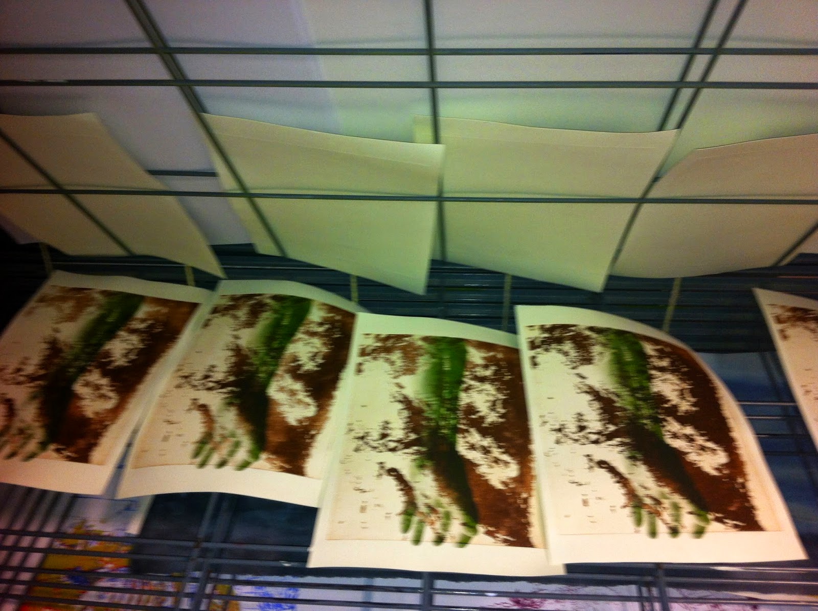
These are three prints from the collographic plates I showed in the last post; there is a coloured one of the middle piece which I did not photograph unfortunately as it is much better than the monochrome. The skin effect of the top one has great possibilities for further development.
 
Here is another picture to whet your appetite - I will explain in my next post what this was all about: