Patricia Green

Saturday 23 March 2013

Thinking about inking

I promised loads of pictures but before  my own go up let me tell you about my present reading and how I came to it.

I am not sure if this was mentioned  but when I was doing the CMS elective, one of the projects Mike Canning gave us was to investigate about eight journals in the library, under a number of headings; I had already glanced at them but this was a very good exercise and everyone agreed that it took the awe of these publications away and we all felt that they were far more accessible than anticipated.
Anyway, when checking out Artforum I came across an article reassessing the critics Robert Hughes and Hilton Kramer ,and the authors were less than complimentary in their view.
Hilton Kramer I did not know well but on checking him out I found that he was quite conservative; however, Robert Hughes I knew very well, having bought Time magazine for years(even though I intensely disliked its political stance -and you know the Americans think Time is  left-wing?!) solely to read his art reviews. I had also seen The Shock of the New (and bought the book) and more recently bought and read Goya. I was, therefore aware that Hughes did not suffer fools gladly (or at all).  During the course of the article the author mentioned appreciatively Hughes' essay collection - Nothing if not Critical, and i discovered it was in the library.
One riffle through it was enough to convince me that this was a book I wanted (really, are there any I don't want?)

Shorten the tale - I have been reading it every day going back and forth on the train and I feel it should be mandatory  for all students - even though it was published in 1990. The Introduction alone is so relevant  to exactly now as at that time there was a serious post-boom slump in western economics. Many of the reviews are a paradigm of concise analysis of a particular artist -and not all are complimentary.


This portrait from 2001 by Bill Leak has the same name as the book and was done shortly after Hughes had suffered  a near-fatal car accident. To me it captures what I remember of the critic so well.
 
All of the foregoing was a rather long preamble to one particular review - Deco and Fins (p.196) - dealing with a show in the Brooklyn Museum on the late 20s and 30s in American design and art ( covering my favourite Precisionist art ). He mentions a couple of names which I noted and researched when I got home, but he one that really stands out is Norman Bel Geddes and I am going to show a number of his designs. It is hard for me to explain how much I am affected by these lost dreams of an ideal and madly optimistic future.


Everything was streamlined......
 
.....even things static.


It reminds me of the Eagle Comic  and Dan Dare.
 
 
And how about this for a logo:


Compares quite well with Durer's from some time earlier:


After all that here is what I have been doing in the last couple of weeks:


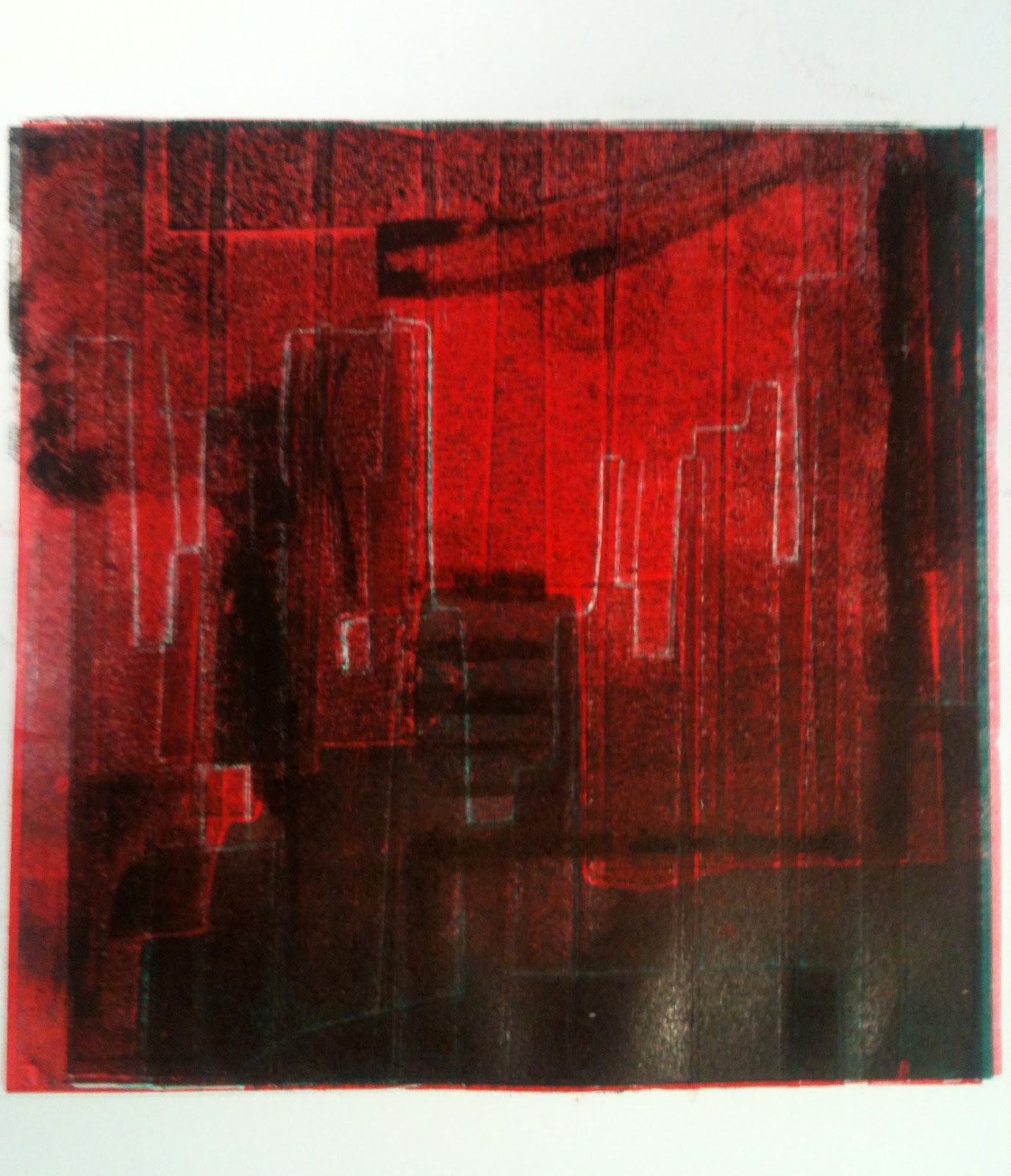
These are all a combination of acetate prepared with tape and glued graphite, drypoint, and  monoprint except for the last which is a reduction woodcut and this will undergo at least one more cut.
 
I think that's enough to be going on with.
 

Friday 22 March 2013

Intense

Today was another new experience in that there was about four and a half hours of lectures all of which were very absorbing and all very different.
First Susan Halvey gave us a very thorough run through symbolism mentioning quite a number of artists whose names were  unfamiliar to me. Probably the most famous of the Symbolists was Gustave Moreau (1826 -1898) and this is certainly his most well -known picture:

Salome


There are many others but the father of Symbolism was thought to be Gauguin and one  of his paintings that falls into this category is this:

 
Where do we come from?What are we? Where are we going? 
 
However there was one painter in this group whose most celebrated picture always fascinated me even when I knew little of the Symbolists:
 
Arnold  Boecklin - Island of the Dead
 
Think on these.
 
 
The second lecture was a very comprehensive examination of the concept of Style through classicism in architecture. I really liked this subject as architecture has alwaysappealed to me as an integrated art form.The Villa Rotonda (the proper name of which is the Villa Almerico -this I learned for the first time) of Palladio (c.1501)  is a building in the classical style but adapted to its time :


I particularly liked the last part on the classical style in modernist architecture such as the work of Peter Behrens:
 
and look forward enormously the the discussion of the Bauhaus
 
Immediately after lunch (very brief ) we were into a studio seminar on the concept of the city with  Kieran Cashell. The idea of the urban is becoming something that is central 21C art practise - after all a recent survey has shown that now 75% of the world's population lives in cities.
He gave us our essay subject - " Urban Imagination" ;  - I have started making notes.
 
 
Loads of pictures tomorrow.
 

Monday 18 March 2013

Snake-free path

Its a bit esoteric, but think about it.

Moved around a good bit this weekend from Thurles to Dublin to Dun Laoghaire to Rathfarnam to Clane to Thurles by way of train, Luas, Dart, and car, and in the course of this travel picked up a number of interesting images some of which I have worked on a bit and which I feel have potential for further development - drawing, print and maybe later even paint.

Here is a selection without any more comment:


Friday 15 March 2013

a week in print

Well, here I am in print now and getting used to the idea and more importantly after a slow and indeed rather unnerving start, things have got steadily better :

 
Old studio; new spot; new wall

 
First prints - rather abstract monoprints from a drawing of an imaginary city,  but I am feeling my way steadily back into it.
 
Here are some ideas for more urban print:


Interesting evening yesterday - Thursday;
stayed late and then after something to eat went to three openings:
 
Ormston House - Paraic Leahy - Behold the Scaffolding on which Beauty is Built
 
Raggle Taggle - Carl Doran  - Cats Tales
 
Limerick Printmakers - Fiona Quill
 
No pictures yet but I will be revisiting all when shows are quieter; there was a steady flow of enthusiastic print 1st years viewing and socialising throughout all three venues: allcomers were mightily impressed by all the art on view but it is fair to say that Fiona's offering was extremely powerful and a certain colleague was heard to say that she would like to buy them all and another proclaimed that this was what she saw herself making. I am looking forward to going back for another look.
 
Paraic Leahy's paintings were extraordinary as were Carl Doran's collages
More on these later.
 
Great to meet the merry band from Full Up again and hopes of more of the same.
 
Nearly there:
 
Public Print


Monday 11 March 2013

New boy again

So the same thing happens as so many other times in ones life - struggle,struggle, struggle to climb up only to  find that when one has arrived at where on wants to be............... one is at the bottom of another hill!

No, I jest  - it is absolutely wonderful to be starting a new project and I was out wandering around in the old part of Limerick today at the usual - talking pictures and thinking about the urbs.

Sic


It can have a surprising range, can't it?
 
 
......but for some you don't even have to leave the studio:
 
 
We will continue  but in the meantime we musnt forgat other parts of the city:
 
Public Print


Saturday 9 March 2013

In

Yaaaaaaaay!

Dear me, that's extremely childish!

Don't care!  I got my first choice (as I hope did everyone else ) and now I am a print student........hope I can live up to it.


This afternoon I went back to the Source in Thurles to meet someone and I had a good look at the Full Up show and it really does look great -I took a little video of it and I will see if we can get it up here - if not I'll transfer it to YouTube and try it then:

 
Ok  -that took rather longer than I expected  - but here it is............. have a great weekend.

Wednesday 6 March 2013

Less is More

How bizarre! From one extreme to another - after the madness of last week, this week it's only tension as people worry about their choices and then worry will they get their first - Friday will tell all - I know where I want to be .

This person has the right idea regarding public art:


Could be a student with financial problems moving between LSAD and Ormston House, of course.

Talking of moving, we were down in Georges Quay for CCS again (more in a minute) but with every day I walk around Limerick there are more strange images to suck up:

 
What is this?
 
Indeed, what is this?
 
 
Urban fabric.
 
CCS today was about Japonism and Orientalism, the former having a very direct influence at the time of Impressionism and Post -I; the later was more of a cultural and even philosophical effect which spread widely through Western(?) thinking and indeed is still deeply ingrained in our attitudes.
 
I knew a bit about the effects of Japan in Europe, and particularly of Japanese woodblock prints as they have always fascinated me:

Hiroshige
 
Hokusai
 
- and I knew that many artists - notably Van Gogh and Toulouse -Lautrec - had produced work related to these. But I had never before seen the prints made by Mary Casssatt:


These are really beautiful
 
 
The other part of our lecture concerned Orientalism, a term coined by Edward Said, and the cultural attitude it defines elaborated by him. This led into our second lecture which was really a video interview with Dr Said where he goes into his ideas in some detail. This should be mandatory viewing for all western children at least once yearly simply so that they might mature with a more balanced view of the whole world.
 
 
Public Print